From concept to implementation

Design and communication are inseparable concepts. Every choice – form, function, ergonomics – creates a language inseparable from the brand.


For this language to be consistent and truly effective, it takes a method for analysing context and defining objectives; experience to understand different markets and cultures; and multidisciplinary know-how to develop coherent branding, websites and integrated marketing strategies.


For over 20 years, I have used these assets to turn insights and ideas into solid corporate identities, capable of representing and conveying a company’s image around the world.


Domenico Amodeo


Ready to make
your brand shine?

Ready to make
your brand shine?


Client

François Bonjour – Artist

Date

October 2025

Sector

Art

Services

Web Design

The challenge

Challenge
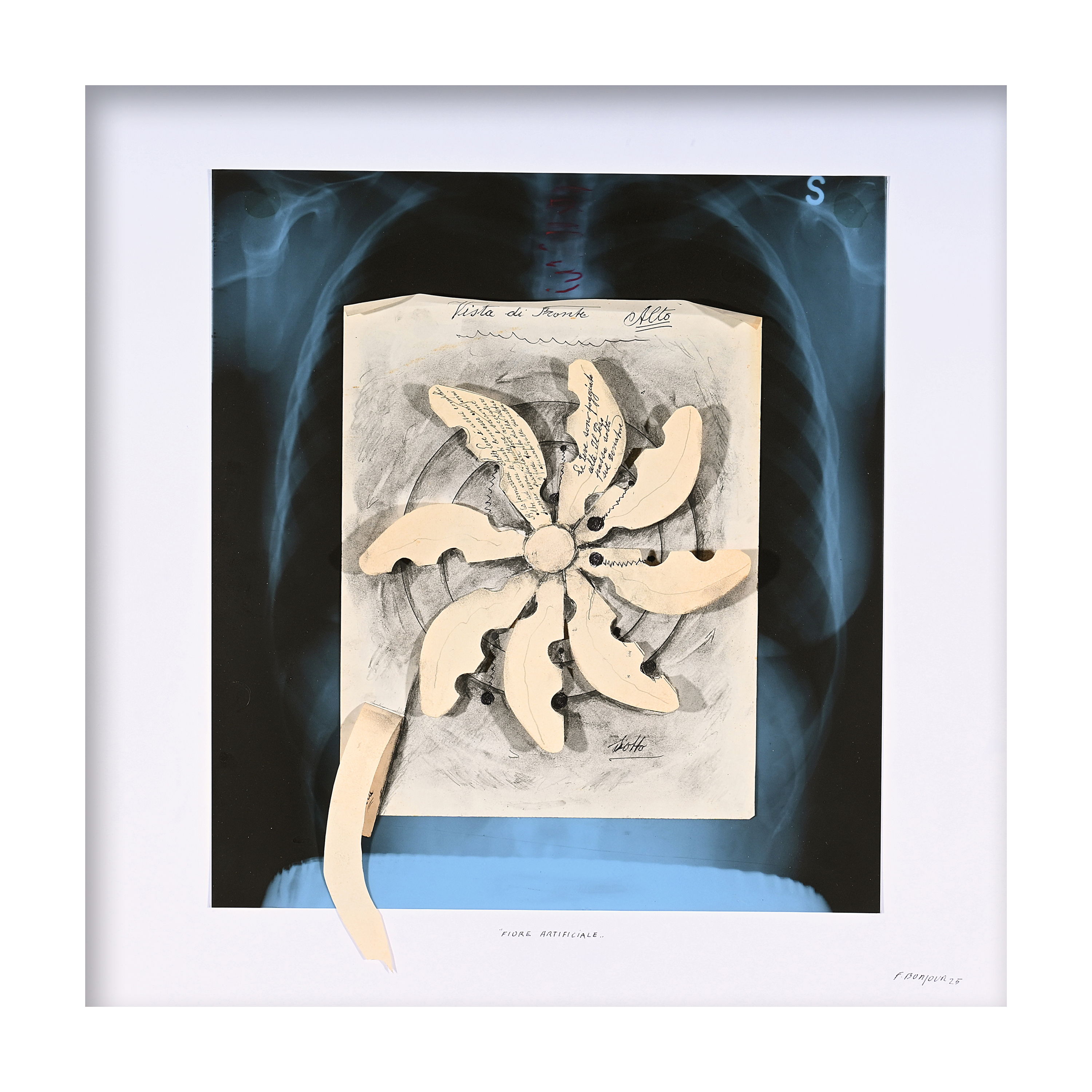
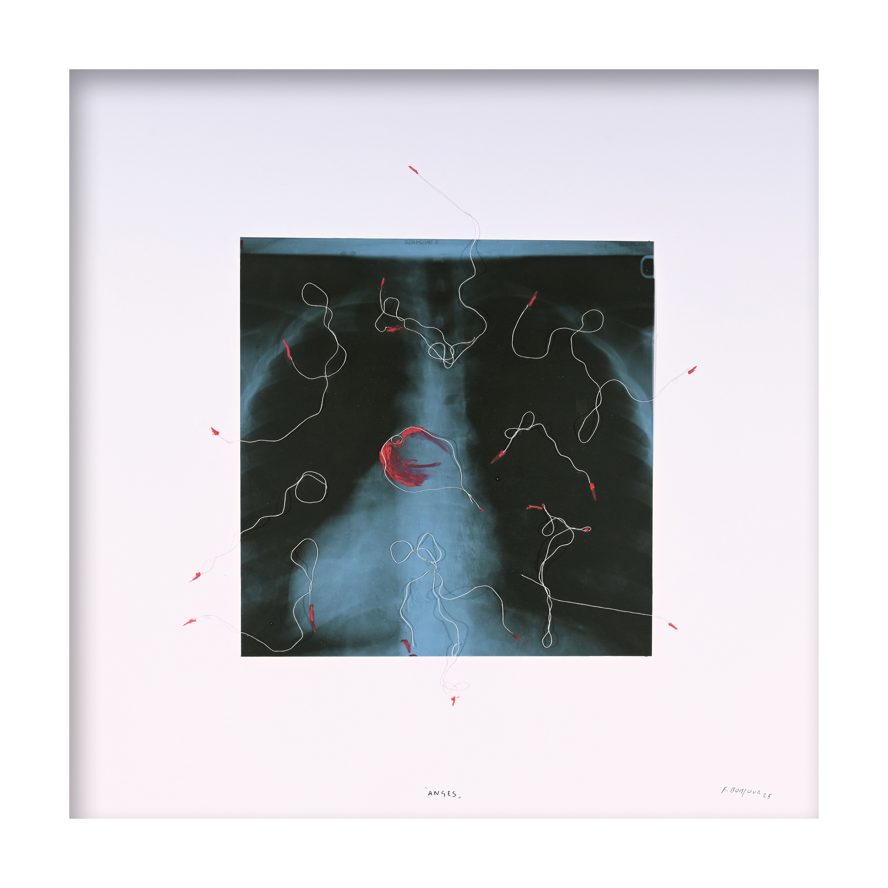
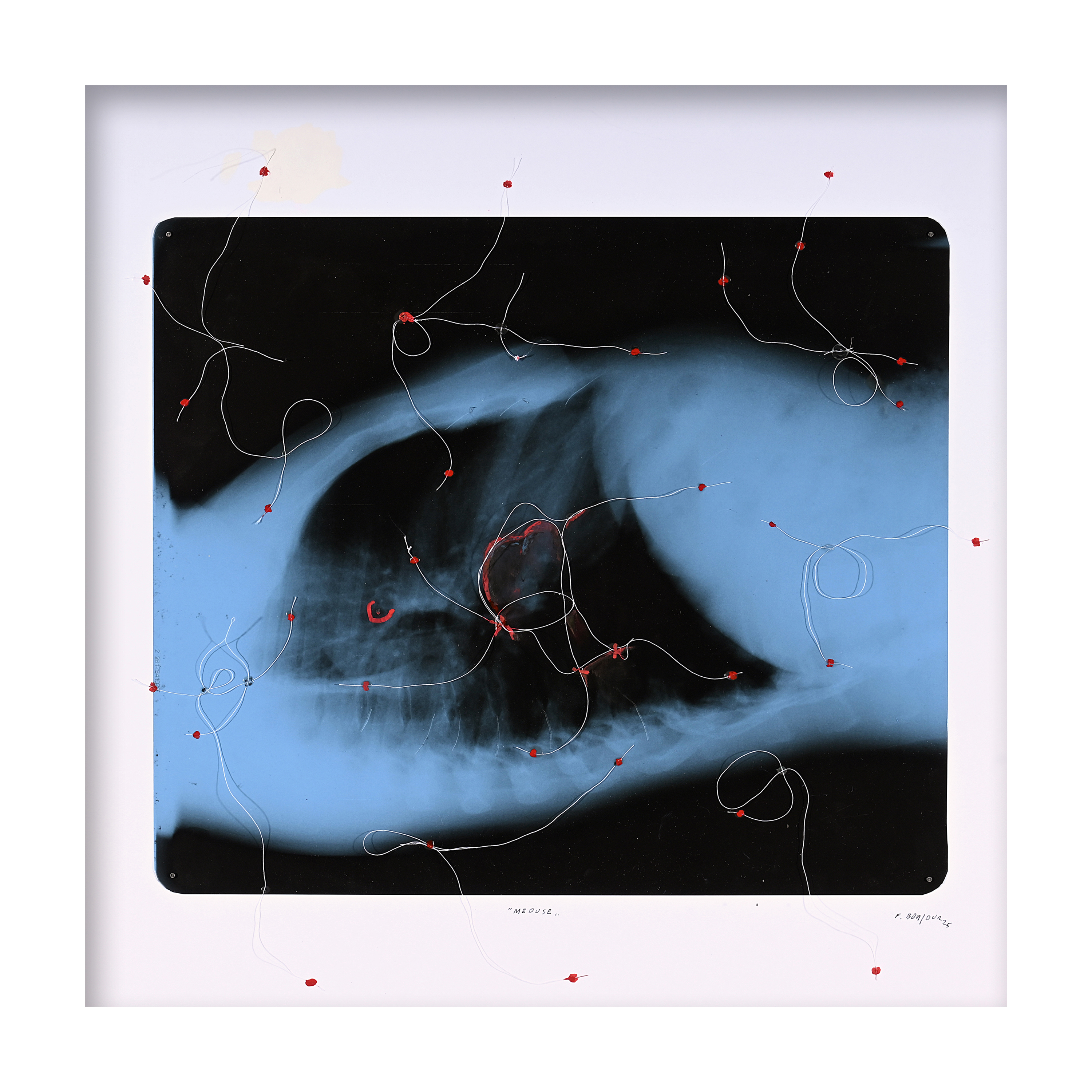
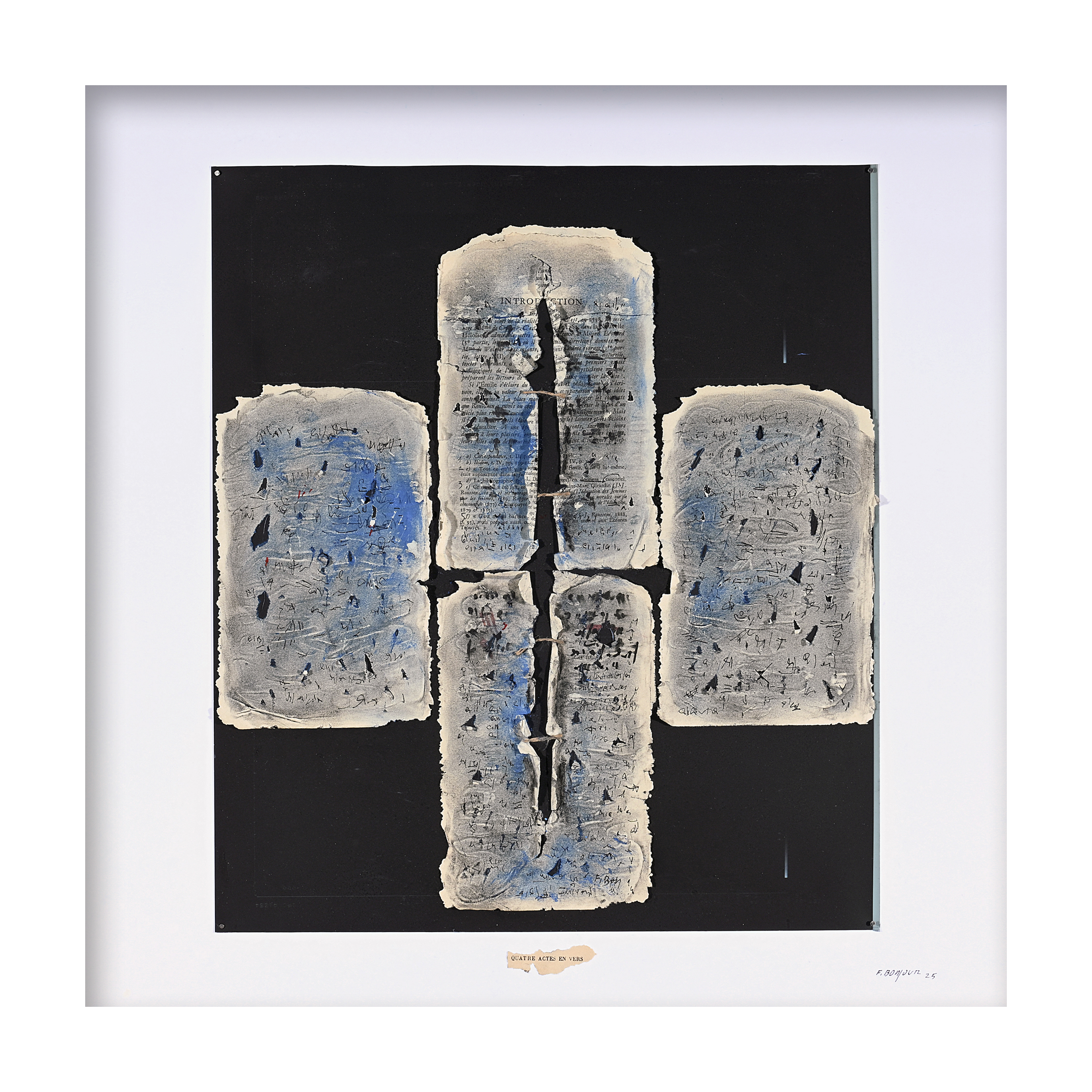
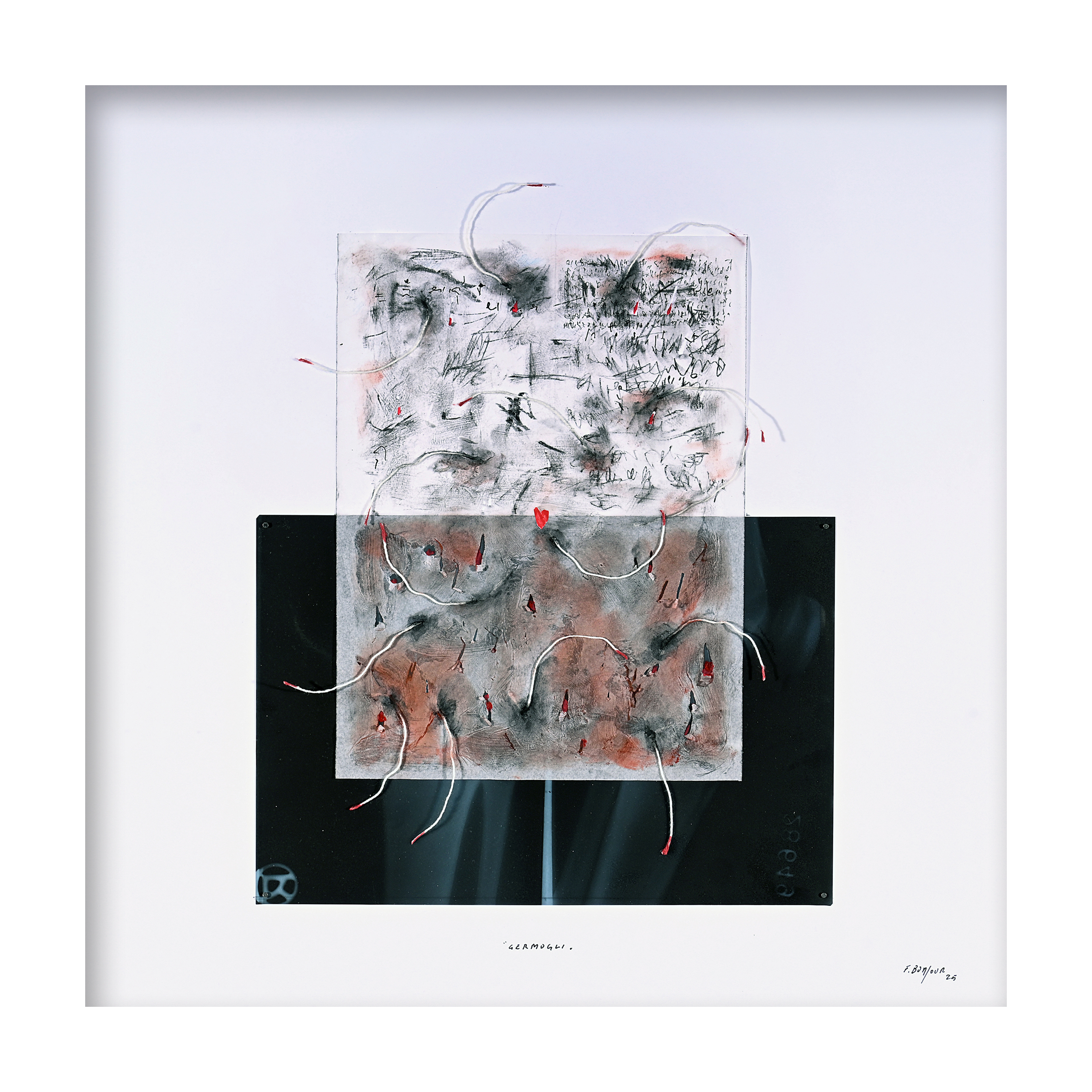
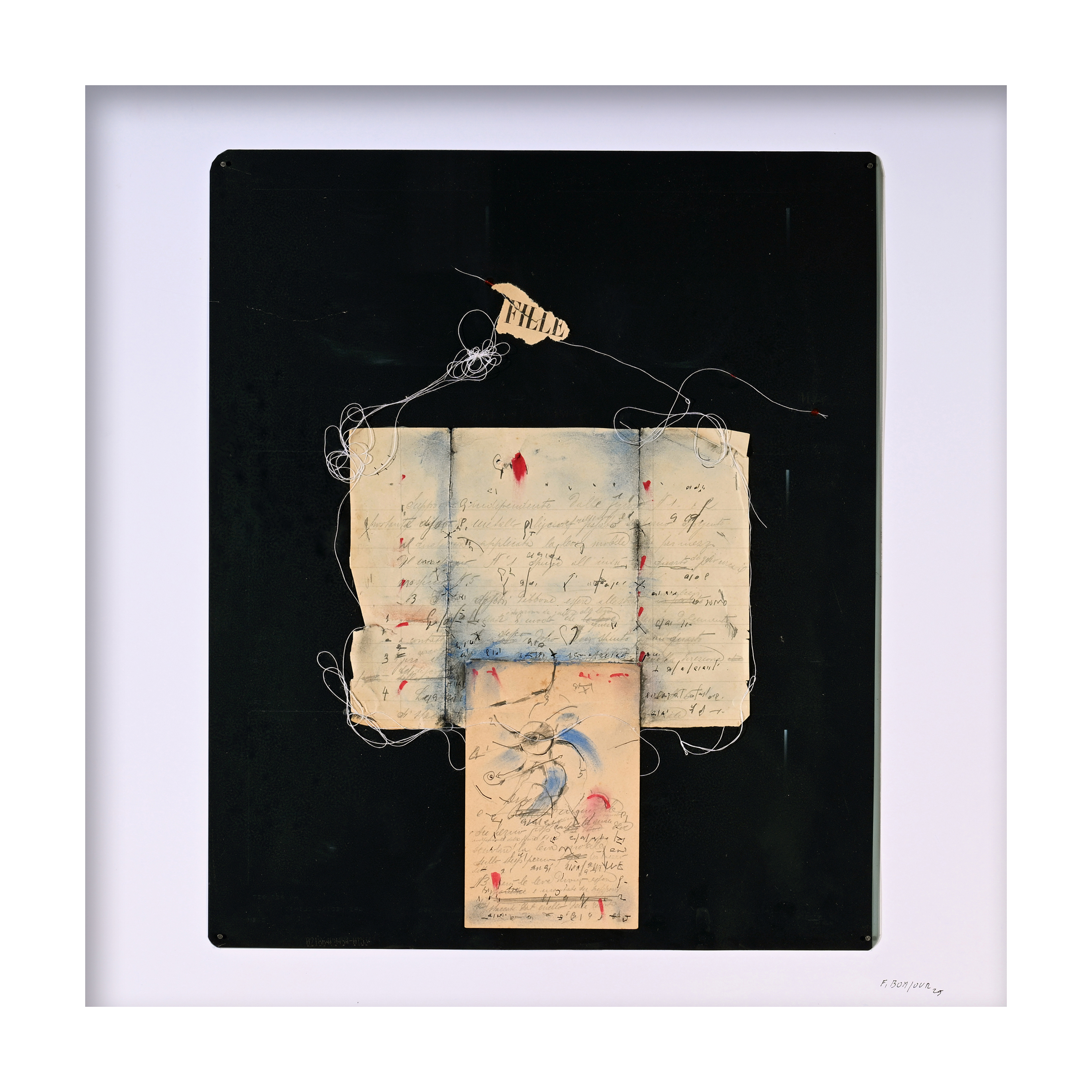
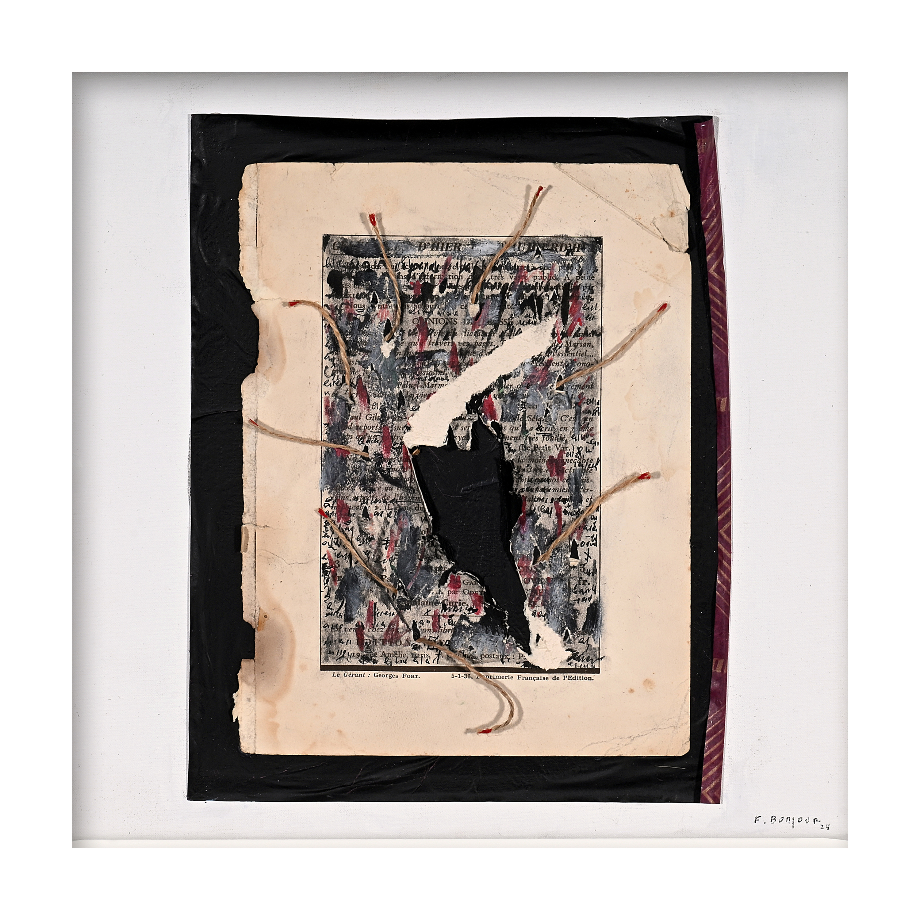
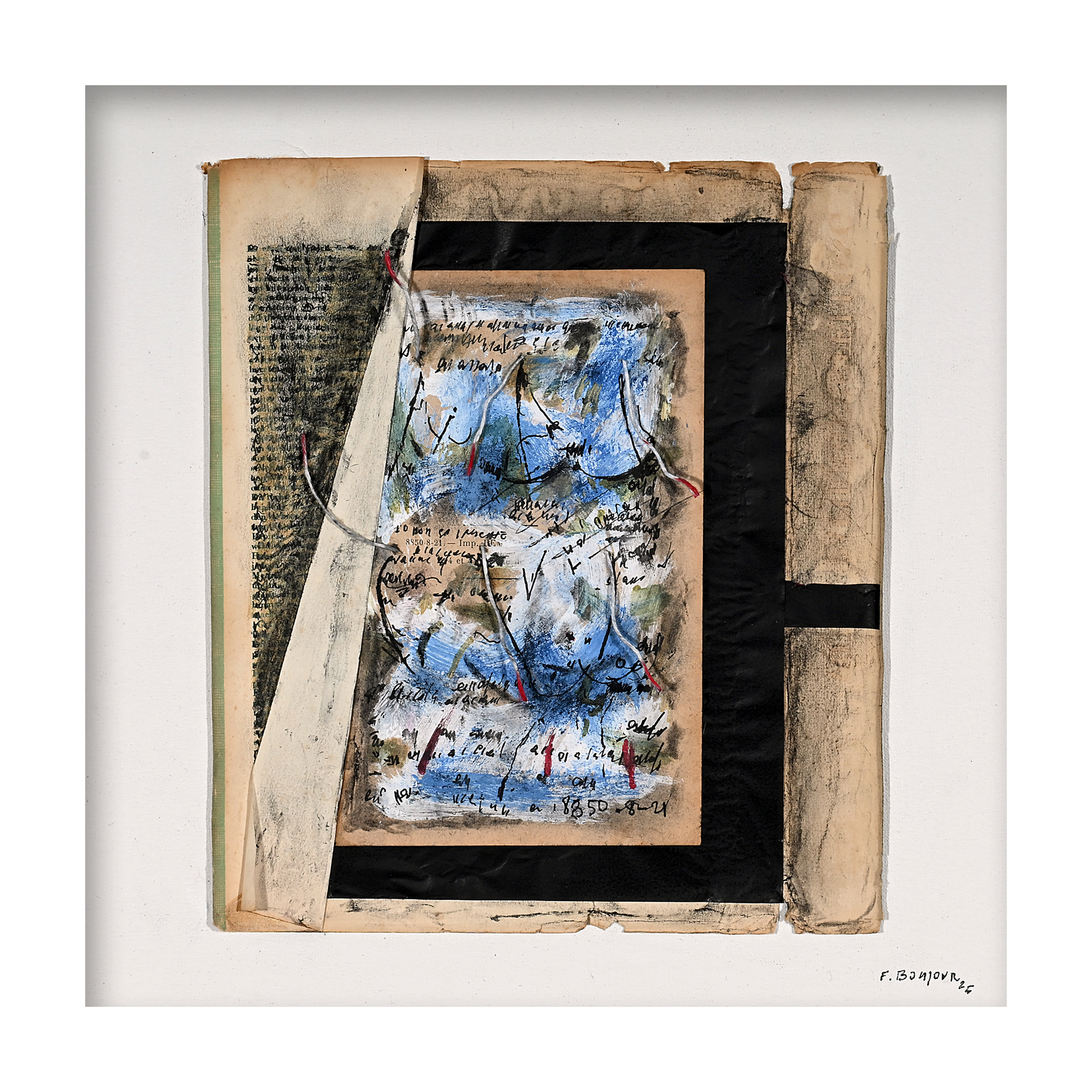
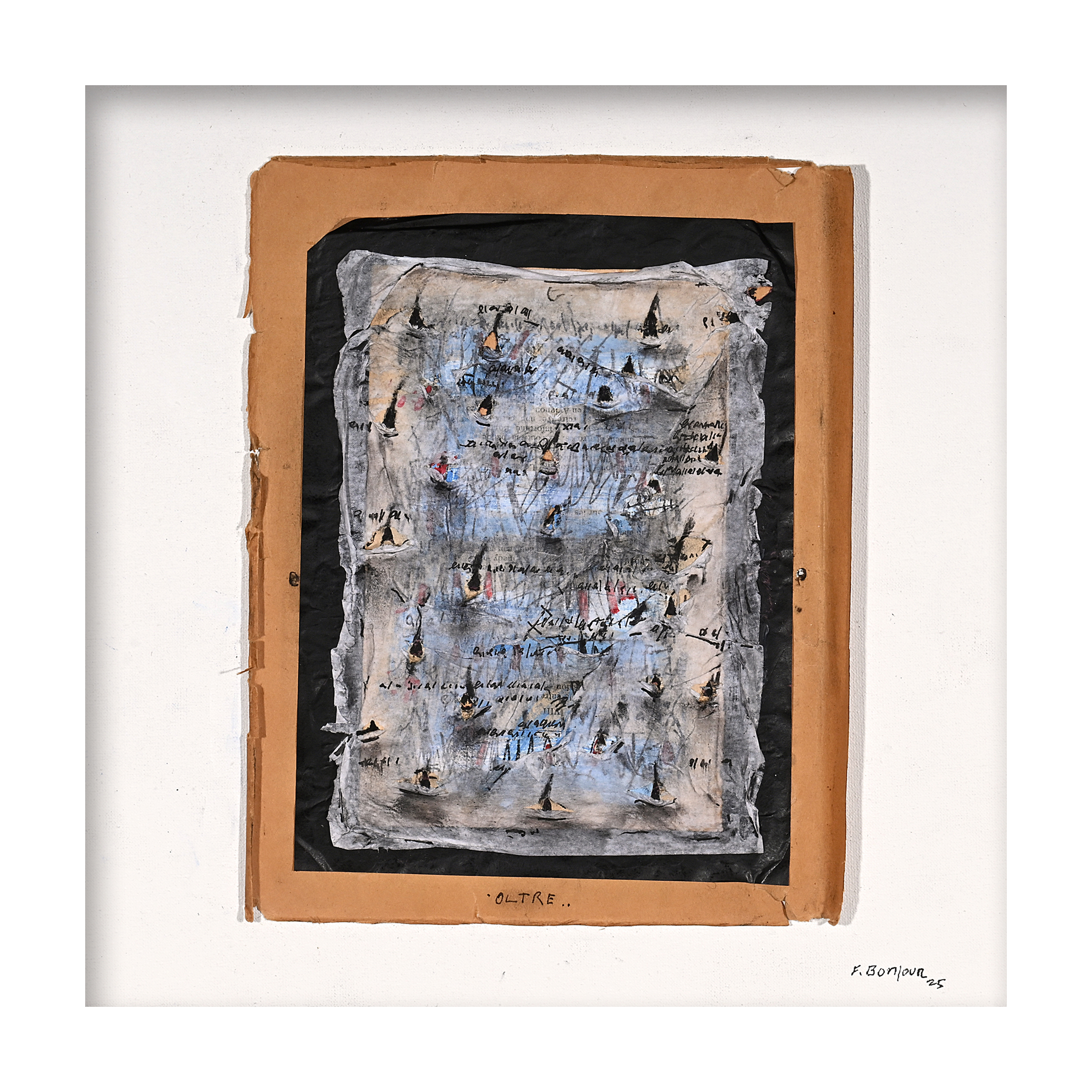
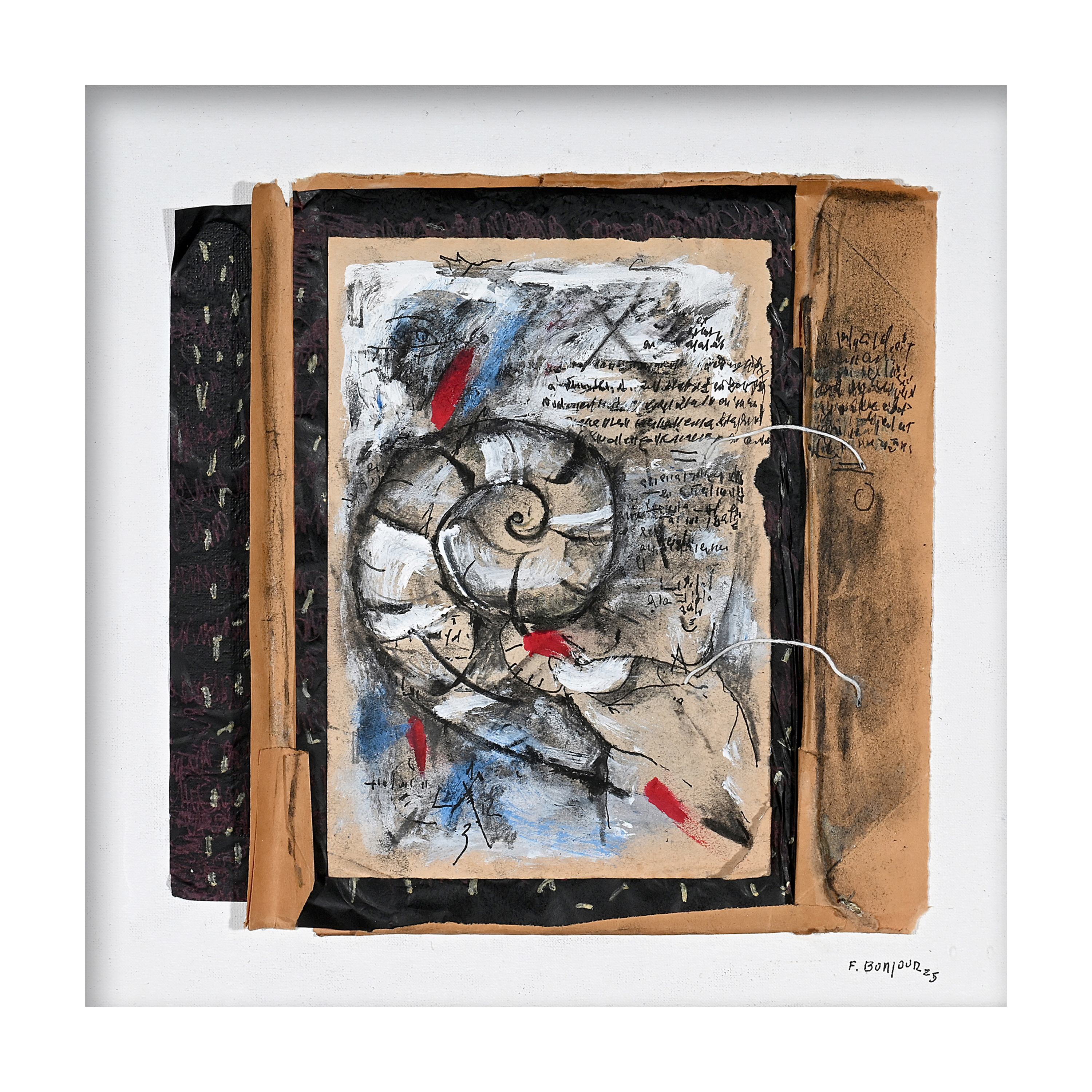
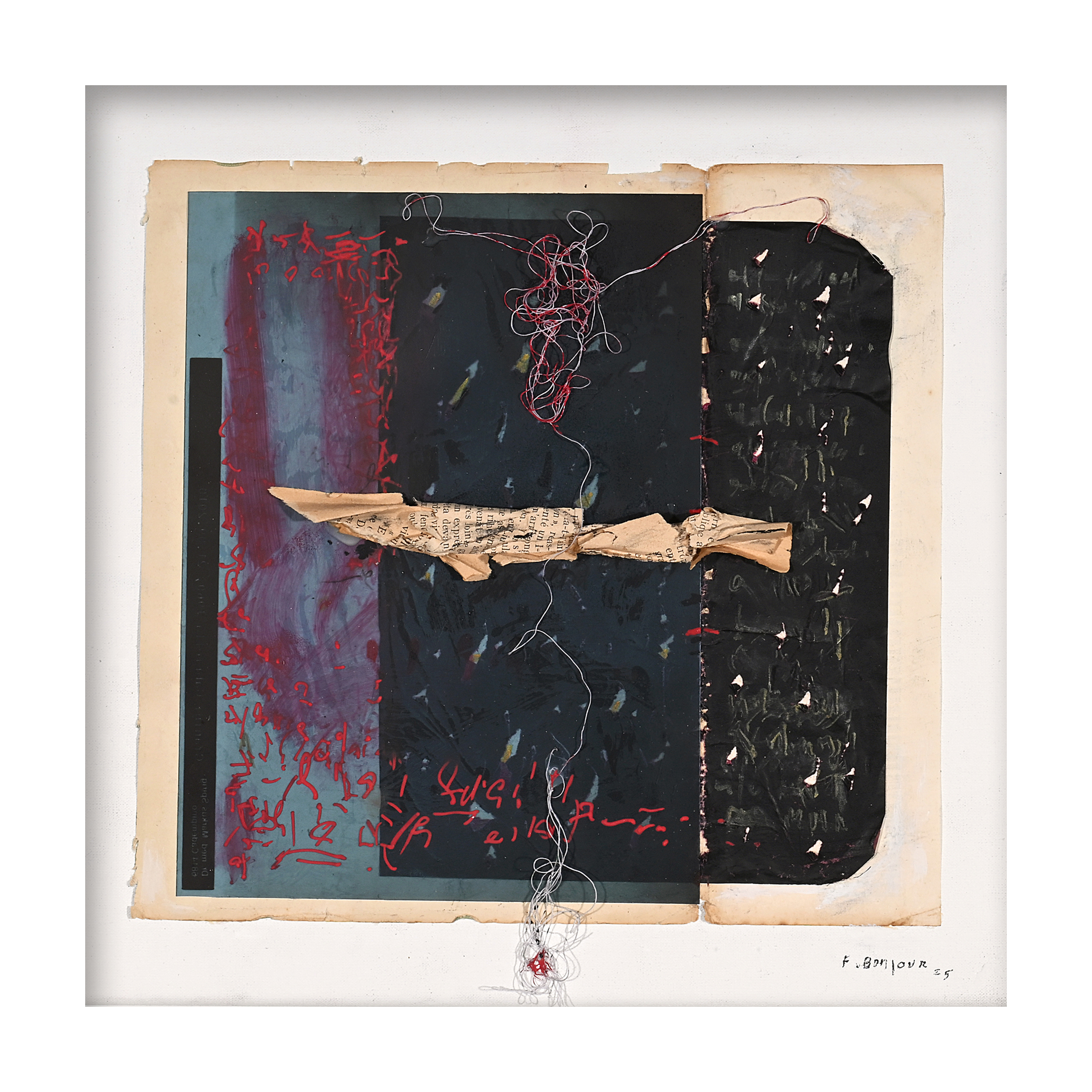
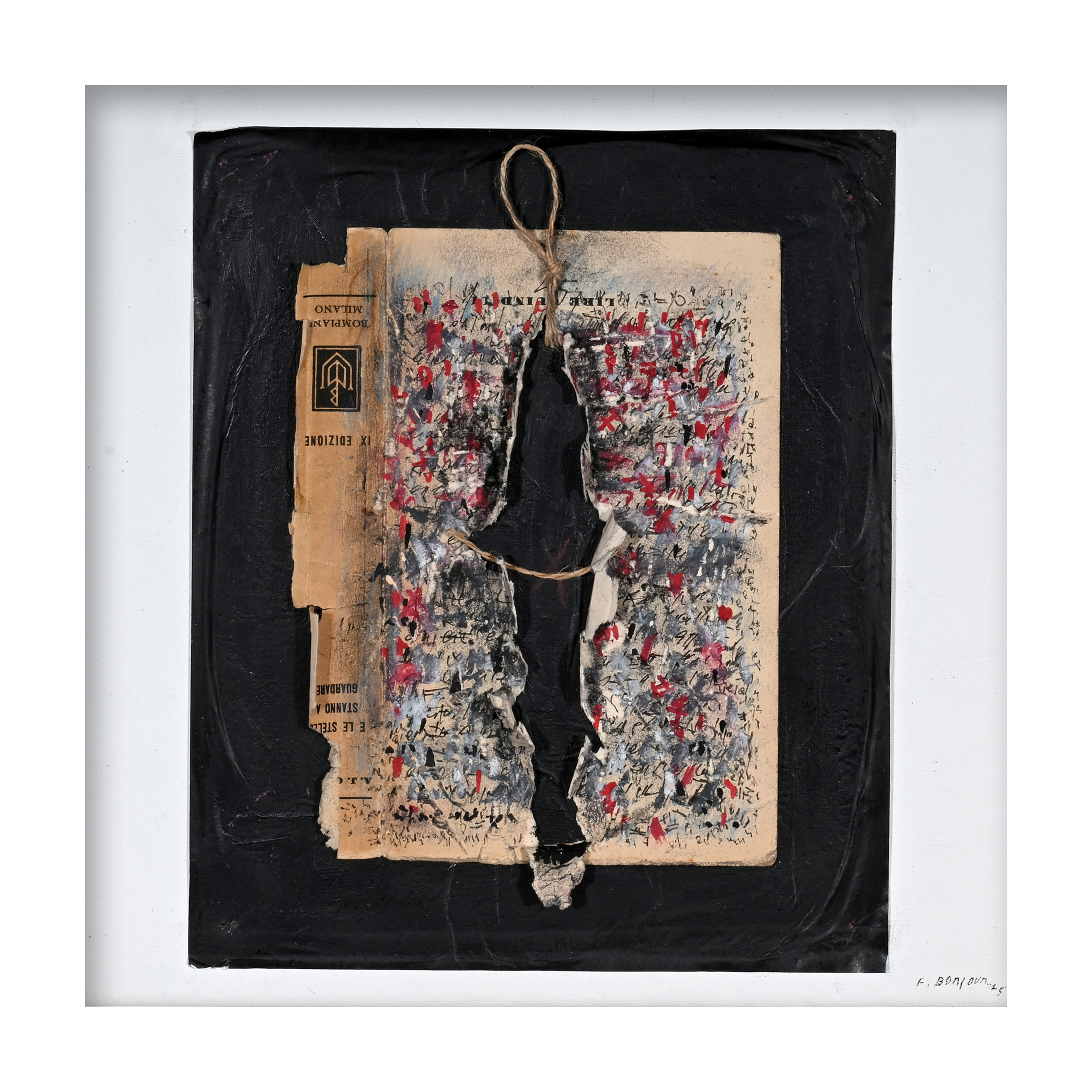
François Bonjour is a Swiss artist who has been active for over fifty years, known for his poetics of humble and reclaimed materials, in keeping with the aesthetic of Arte Povera. Paper torn from old books, ropes, wood, wax and even X-rays become the “skin of the city” in his work: elements charged with memory and time that he assembles with rigour and lyricism. The result is a balanced, immediately recognisable visual language that quietly but directly communicates the stories inherent in matter. I had the privilege of designing his new website, with the ambitious aim of translating this unique visual and artistic identity into an engaging digital experience. The brief was not simply to “create a website”, but to shape a living, narrative space that conveyed the visual and poetic strength of Bonjour’s work, highlighting its evolution over decades of artistic practice.

Objectives

The main challenge was to communicate such a rich, layered artistic universe digitally while keeping the soul of the works intact. The website needed to speak to different audiences, from the casual visitor to the art connoisseur, without losing coherence: a place for both poetic emotion and concrete information. There were also many specific requirements: more than 50 years of work to present, over 300 digitised pieces, critical texts, a biography, solo exhibitions and group exhibitions. A vast amount of bilingual content (Italian/English) had to be organised while ensuring fluid navigation and a sense of discovery. Respecting the artist’s sensibility was essential: avoiding a simple gallery or standard template, and instead designing a bespoke digital space attentive to the material and contemplative qualities of his art.

In essence, the aim was twofold: clarity and depth. Clarity in presenting information and images accessibly; depth in suggesting meanings, emotions and connections without ever betraying the spirit of François Bonjour.

Design

Design

The idea

I conceived francoisbonjour.art not as a simple showcase, but as a place to explore, like a room of memory where every corner reveals something. I wanted users to enter with the curiosity of someone crossing the threshold of an artist’s studio: not a rigid structure of predefined sections, but an organic journey of rhythms, relationships and surprises. Certainly, the website needed to present the works and information clearly and directly, but welcoming visitors and inviting discovery was equally important. The result is an almost tactile digital space, echoing the tangibility of Bonjour’s art, which tells not only of the artist and his works, but also of an emotion, a story, an idea.

Video

Video
The homepage opens with an immersive hero video that, like a visual curtain, immediately introduces Bonjour’s unique atmosphere. For more than three minutes, images of his works alternate between overall views and microscopic details, transporting their material nature into a mystical, almost dreamlike setting. Enveloping music accompanies the slow rhythm of the visual sequences, which open and close like deep breaths. Grain, glimmers, fragments of matter: the opening video acts as a sensory threshold, preparing the gaze for a different pace – slower, more attentive and contemplative – and inviting users to immerse themselves calmly in Bonjour’s world.

UX & Navigation

Design
I adopted a deliberately immersive design: long, layered pages unfold vertically to offer an in-depth narrative. This choice demands great care with orientation and navigation, which became essential design considerations. To prevent visitors from getting lost in the abundance of content, I added fixed, always-visible side menus that act as a structural compass. Present in every main section, these navigation menus let users move from one part to another while retaining a sense of where they are. The main menu outlines the major chapters (Works, Profile, Solo Exhibitions, Group Exhibitions), while the side menus subdivide these complex chapters and make them navigable. Potentially boundless stretches become coherent sections, with every piece of content a click away without interrupting the experience – much like a well-curated exhibition, where rooms follow one another naturally and visitors retain a mental map of the route.

The heart

Heart

The heart of the design lies in the experience of the works. Each artwork is presented in high resolution with two levels of zoom: the first shows the whole work, while the second brings users within a few centimetres of the surface, into the fabric of the material.

Behind this ease of use lies an enormous amount of craft: digitising over 300 works, in some cases by scanning historical printed catalogues, and meticulously refining the colours, crops and digital framing of every image.

The result surprises users on two fronts. On one hand, the finest details of Bonjour’s art emerge – the density of colour, the fibres of pasted paper, the traces of time and the artist’s hand – almost offering touch through the screen. On the other, the system provides a new, comprehensive overview: browsing the works reveals the evolution of his style over the decades, with its continuities and changes. The result is a vast, immersive visual journey, a living archive that tells an artistic history without words.

Concept – Neogenerative Semiotics

Concept

Entering François Bonjour’s website is like stepping into a layered narrative, where every visual and conceptual level adds meaning without betraying the central core.

At first glance, the design is simple and restrained. Yet scroll by scroll, click by click, it reveals hidden depths: the experience gradually gains new fragments of meaning. None of this is accidental; it is the result of applying theoretical principles that matter deeply to me.

During the design process, I drew inspiration from Neogenerative Semiotics, translating key concepts into tangible creative choices. Three central ideas in particular – parallax, blur and transparency – guided the design and production, bringing analytical precision and narrative warmth together in an innovative conceptual balance.

Parallax

From a neogenerative perspective, it is not merely a visual effect but a fluid mode of interpretation. I designed the website to offer different perspectives on the same content while preserving its deeper meaning. We wanted to speak to different audiences without ever losing the centre. The poetry of the opening motto – “matter and memory, overlapping layers, fragments of light and time that lend their breath to my memories” – offers an emotional, evocative entry into Bonjour’s world, immediately awakening sensibility and imagination.

In parallel, the profile pages and catalogue of works present concrete information – materials, biography, exhibition lists – with documentary rigour and clarity. These are different angles on the same message: the lyrical atmosphere that resonates with the viewer on one side, and the factual structure that reassures the art connoisseur on the other. Just as in a parallax effect, these layers of communication move in harmony: the viewing angle changes, emphasising emotion or explanation in turn, yet remains perfectly aligned with the shared semantic centre – François Bonjour’s artistic vision. The result is multifaceted but cohesive communication: the user’s perspective can vary, while the narrative core remains firm.

Blur

Alongside the multiplicity of perspectives, I chose to embrace a slight controlled blur. Rather than communicating everything meticulously and with absolute definition, the website deliberately leaves areas of evocative ambiguity, like the aura of memories. After all, memory often consists of blurred images: barely outlined profiles, fading details, emotions filling empty spaces. Similarly, the website’s visual and textual elements give users room for interpretation and stimulate their own imagination. The opening poetic statement, for example, does not spell out every meaning: it suggests, alludes, sparks intimate associations in the reader. Everyone is free to project something of themselves into it, finding resonances with their own experience. This semantic openness is carefully calibrated, however, and never descends into chaos. I widened the “bubble” of meaning just enough to accommodate subjective projections while maintaining a shared emotional convergence and preserving the overall sense. It is a delicate balance: avoiding excessive vagueness, which could confuse or disappoint users, while also resisting excessive rigidity, which would make the message sterile and cold. In practice, the visual and verbal language engages users emotionally and imaginatively, creating a deeper, more memorable bond. This intentional “blur” – also visible in the layout, for example when background images fall slightly out of focus at the edges of the screen – becomes a tool for semantic rewriting. It allows visitors to actively reinterpret the content and make it their own, much as we reinterpret old photographs whose outlines have faded but whose emotional value remains intact.

Transparency

The third conceptual pillar is transparency, which I understand here as a semiotic threshold between different levels of meaning. My guiding metaphor was that of glazes in painting: in many of Bonjour’s works, what appears on the surface is only part of the composition, and the truest meaning emerges by looking through the overlapping layers. In the same way, I orchestrated a multilayered experience in the website design. On the surface is a clean, minimal, immediately accessible interface; beneath it unfolds a rich narrative and informational layer. Whenever users make a transition between levels – for example by clicking “Profile”, exploring works in detail or downloading the press kit – the communication reveals a new layer of meaning, adding context, data and stories. We might call this approach ThroughView Semiosis: the message is designed not to be exhausted at first glance, but to reward curiosity through successive stages of revelation and exploration. Transparency here is both visual and cognitive. Semi-transparent graphic elements and overlapping images and text symbolically convey a desire to “let people see through” things. This makes visible not only the strengths in the foreground – the beauty of the works and the promise of an intense artistic experience – but also the evidence and background that support that promise: the artist’s history, the list of his exhibitions, and the humble materials he has transformed and ennobled over time. It is an honest dialogue with users, who perceive coherence and depth in what they see: they know that behind every image or phrase there is a reason, a tangible design intention. This gradual approach to communication does not overwhelm visitors; it builds their trust. Users feel they can rely on a transparent message that does not hide details but reveals them at the right moment, making navigation a continuous discovery.


These integrated perspectives create a true narrative ecosystem, fully consistent with the vision of Neogenerative Semiotics. Every design choice – from the multilayered rhythm of navigation to the slightly out-of-focus backgrounds and texts alternating between poetic and informative tones – helps translate theory into practice. There is precision: nothing is left to chance, and every level of content is designed to preserve the central meaning and guide interpretation. And there is warmth: the experience is enveloping, human, able to speak to both heart and mind. The overall effect is a cultured yet accessible digital narrative, where layering and depth enrich rather than weigh down the experience. In this project, Neogenerative Semiotics steps out of the theoretical shadows and becomes tangible experience: visitors do not merely “read” a website, they live it through multiple perspectives, subtle reminiscences and revealing transparencies. What remains after exploring francoisbonjour.art is the feeling of having grasped the essence of a creative world naturally and gradually – a coherent, memorable message that settles in the mind. It demonstrates how analytical precision and evocative power can coexist in narrative design, creating a digital experience that reflects the artist’s deepest spirit with honesty and style.

Design choices

Choices
  • Hero video
    We chose to open the website with a long introductory video. This immersive sequence, lasting over 3 minutes, blends fragments of Bonjour’s works into a fluid montage, transporting them into a dreamlike dimension. Overall views alternate with close-up details, accompanied by slow ambient music. The hero video is not purely aesthetic: it serves to prepare the gaze of the user, inviting them from the very first moment to approach the following content with a contemplative, receptive attitude.

  • Layered pages
    The pages were conceived as extended, rich vertical journeys. We deliberately moved away from the idea of “everything at a glance” in favour of a scroll-story: each section invites unhurried exploration, revealing layers of content as the visitor progresses. This layered design reflects the multilayered nature of Bonjour’s art and gives visitors time to immerse themselves in images and texts without rushing.

  • Navigation with clear orientation
    To ensure usability on such a content-rich website, we implemented dual navigation. Alongside the main menu at the top, which divides the site into major chapters such as Works, Profile and Exhibitions, every page has a fixed side menu. This acts as an internal compass and allows users to jump quickly to different subsections without losing their bearings. Wherever they are, it is always clear how to move around and what other content is available, much like following an exhibition map during a visit.

  • Mapping the works
    The structure of the website provides a genuine digital mapping of Bonjour’s output. We organised over 300 works into a navigable catalogue that can be explored by collection or chronologically. Each work is contextualised with details – year, materials, dimensions and any exhibitions – and linked to the relevant exhibitions or artistic series. This lets users reconstruct the artist’s creative journey, relate works separated by time and place, and appreciate the coherence and evolution of his artistic exploration.

  • Progressive zoom
    One of the key tools we wanted to enrich the experience is the two-level zoom on images of the works. Each painting or sculpture can first be viewed in full and then zoomed in on to examine the material texture and fine details up close. This feature was designed to bring the digital experience closer to the real one, as though users could physically approach a painting and inspect every tiny detail. In this way, the tactile and material dimension so important to Bonjour’s art is conveyed through the screen, offering deeper visual engagement.

Result

Result

The outcome is a powerful perceptual and emotional experience that remains accessible and easy to use. From the first seconds, visitors feel enveloped by François Bonjour’s world: the opening video and the aesthetic care given to every detail transport them into a digital environment alive with art and poetry. This sensory immersion is supported by real narrative depth, with a story behind every image and an intention behind every page. Users are not simply consulting a portfolio; they are exploring a coherent creative universe.

Despite the vast amount of material – texts, images and years of artistic history – navigation remains fluid and intuitive. This is thanks to design choices that always keep users informed about where they are and what they can do: they move freely between sections without ever feeling lost.

In summary, francoisbonjour.art now achieves what we set out to do: combine emotion and information in a delicate balance. It is a “living” digital space with a broad cultural outlook, where Bonjour’s art is not only documented but continues to speak to, engage and inspire visitors.

Thematic conclusions

For me, Bonjour is much more than another portfolio project: it marks a significant step in my evolution as a designer. Through this work, I tested and strengthened my design method, confirming the effectiveness of a multidisciplinary approach that integrates theory and creativity. From the initial analysis to launch, every stage was guided by a clear conceptual thread, ensuring coherence and authenticity in the final result. This project perfectly embodies the direction I want my work to take: bringing together strategy and poetry, data and narrative, technology and art. Creating a website like François Bonjour’s means actively helping to share culture, turning an artist’s online presence into an experience that enriches those who encounter it. In terms of my method, Bonjour is tangible proof that apparently theoretical principles – semiotics, storytelling, advanced user experience – can converge in an accessible, impactful outcome. It is a project fully aligned with my path: it required artistic sensitivity, design rigour and an overall vision, qualities I have always sought to cultivate. Finally, helping to tell the story of Bonjour’s art in an innovative way was, for me, a small cultural contribution: we created a bridge between artistic tradition and contemporary digital experience. This kind of challenge feeds my professional passion and explains why I like to call myself a narrative designer: I firmly believe that well-orchestrated design can give voice and light to the soul of things.

"With Domenico Amodeo’s design support, this website and visual identity have become a place where matter, mark and vision intertwine coherently. His strategic approach, based on Neogenerative Semiotics and a rigorous working method, has shaped a digital narrative that reflects my artistic exploration: every visual element is not an accidental detail, but a chapter in the overall story. The result is a place that presents and represents my art, my works and my practice, fully capturing the meaning I have always sought to give my artistic exploration."

Francois Bonjour

Want to discover how you too can achieve your business or professional objectives?

or

Tell me a little about yourself by filling in the form below.


First name *
Email *
Surname *
Phone
Describe your project and objectives

Amodeo Design is committed to protecting and respecting users’ privacy: the personal information collected is used only to respond to this form. It is not used to activate other services, newsletters or any other unsolicited services. Users who complete this form and submit their data will be contacted exclusively by email, at the address provided, to answer their questions. Only afterwards, if the user wishes, may other communication channels be used. At the end of the process, if the contact does not lead to any further engagement, all data will be deleted from every digital or physical archive.

Privacy Policy *

I have read and accept the terms and conditions described in the Privacy Policy.

Works navigator