Design and communication are inseparable concepts. Every choice – form, function, ergonomics – creates a language inseparable from the brand.
For this language to be consistent and truly effective, it takes a method for analysing context and defining objectives; experience to understand different markets and cultures; and multidisciplinary know-how to develop coherent branding, websites and integrated marketing strategies.
For over 20 years, I have used these assets to turn insights and ideas into solid corporate identities, capable of representing and conveying a company’s image around the world.

April 2025
Advanced aesthetics
Studio17 has a substantial history and an excellent reputation. In particular, the centre is well known for expertise, professionalism, cutting-edge technologies and special attention to the client, who is always at the heart of every decision.
Its online image, however, did not reflect either that expertise or the breadth and variety of its treatments.
The website was mainly a single page and failed to highlight key services such as Valmont, Hydrafacial, Alma Lasers and the many specialist Face & Body Contouring treatments, massages and much more, except in a fragmented and incomplete way.
Multilingual content was also missing, despite the business having an established international clientele.
In short, the “Studio17” brand was well known to its longstanding clients, mostly acquired over the years through word of mouth or thanks to its central location on Via Nassa in Lugano. Clients valued the professionalism and expertise they found at the centre, but the business had no online strategy to build visibility and present its services.
The audit highlighted these weaknesses in the brand, particularly by analysing the inconsistencies between the business itself and its online presence.
The solution was clear: the online presence needed to be rebuilt from scratch, with a design that made the brand’s image accessible on the web and communication strategies aligned with the real value the brand has historically represented.
This is where we started.
For the business, the logo represents a brand established over more than 30 years. It is a historic, familiar and recognisable logo... and the very first recommendation was: leave the logo alone.
We did, however, propose a light redesign of the tagline and overall structure, aligning it more closely with a modern, simple design while remaining consistent with the historic identity conveyed by the logotype. We therefore preserved the traditional “Studio17” lettering and introduced a new style for the tagline, improving its centring and legibility.
After understanding the centre’s style, the types and arrangement of its spaces, and assessing the available materials, we proposed the graphic design for the new website. We developed a template consistent with the centre’s actual style, defining the main structure, concept and guidelines.
The breadth of services, treatments and reference brands in the centre’s offer required particular care in organising the content and defining navigation across the different sections. From the user’s perspective, we designed interactive elements that simplify searching and speed up access to information, with a restrained style that is also sophisticated in its design and interaction. For example:
A modern, functional layout
To showcase advanced aesthetic treatments to their best advantage, we chose clean graphics enhanced by evocative imagery and concise text. The result is a harmonious digital environment in which every piece of information is presented clearly and attractively. Navigation is smooth and intuitive.
Sophisticated design and practicality
One of the new website’s distinguishing features is its navigation, with a structure that provides quick access to all the main areas. The elegant, contemporary menus simplify the search for content and make every section easy to reach in just a few clicks.


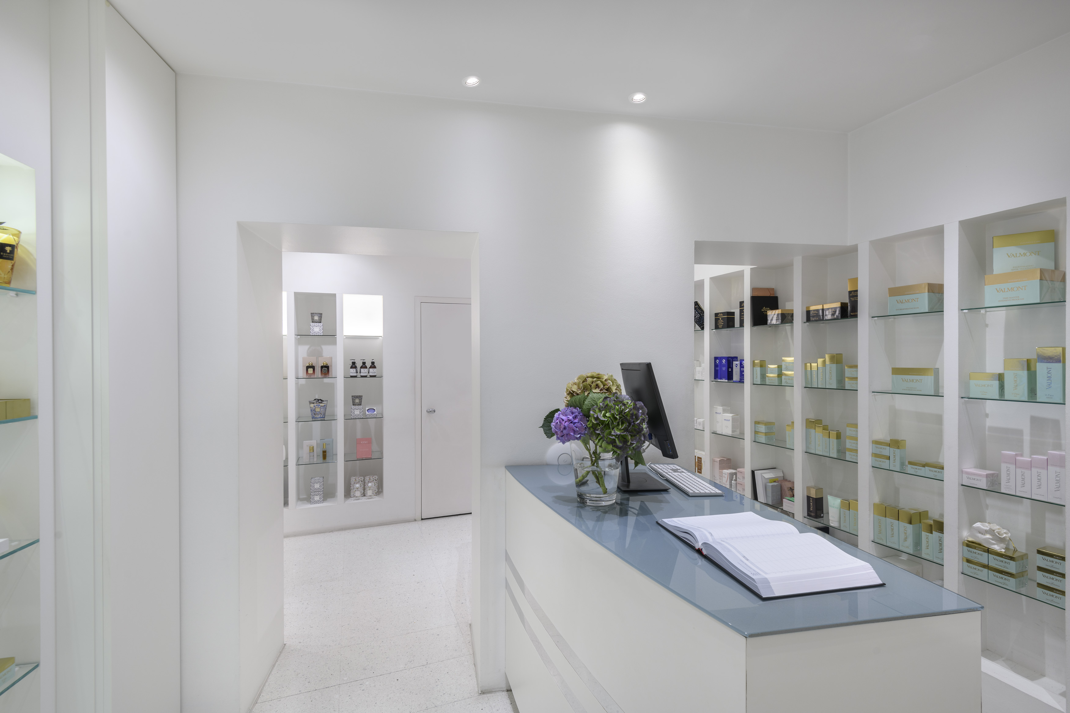
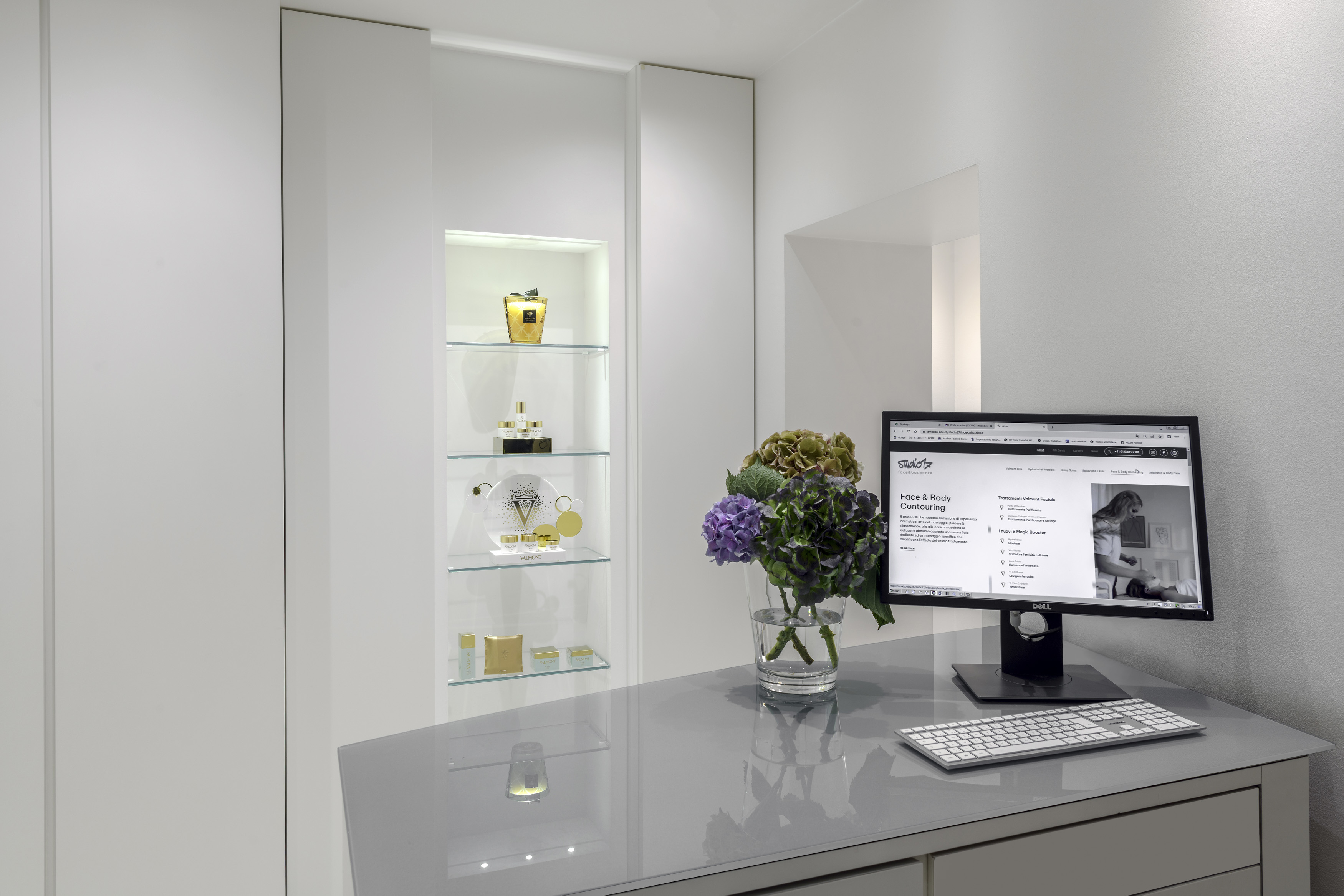
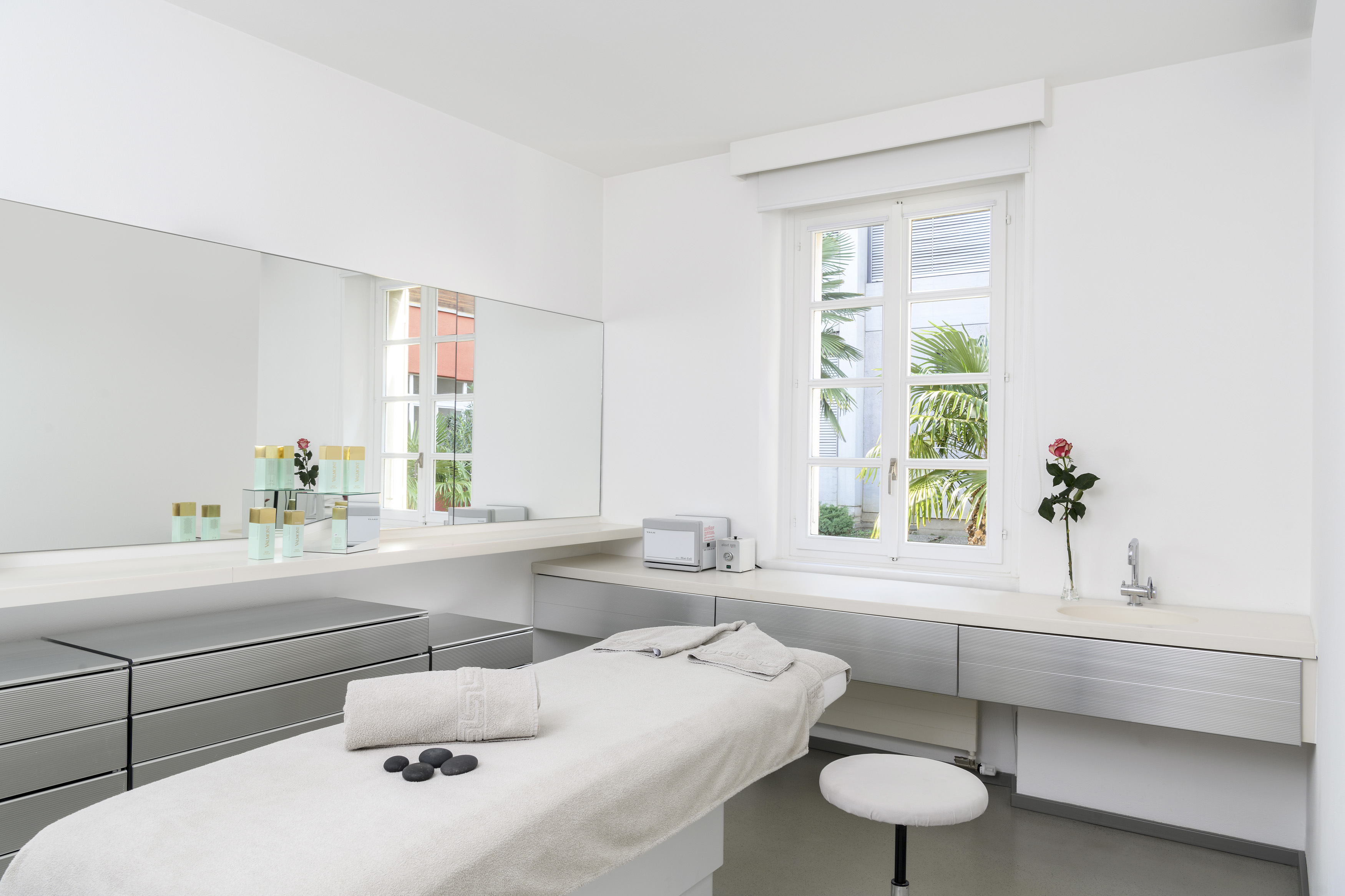
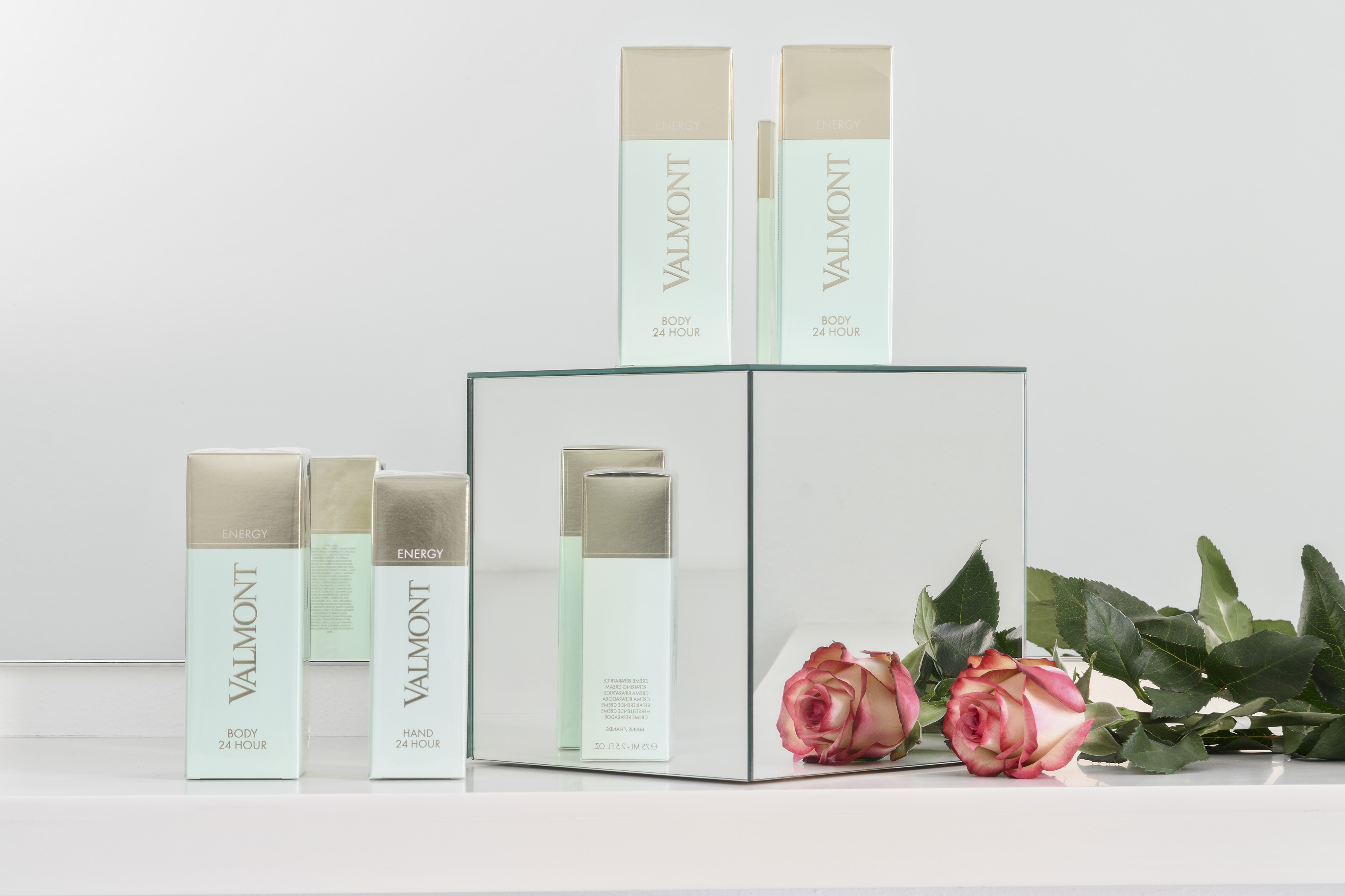
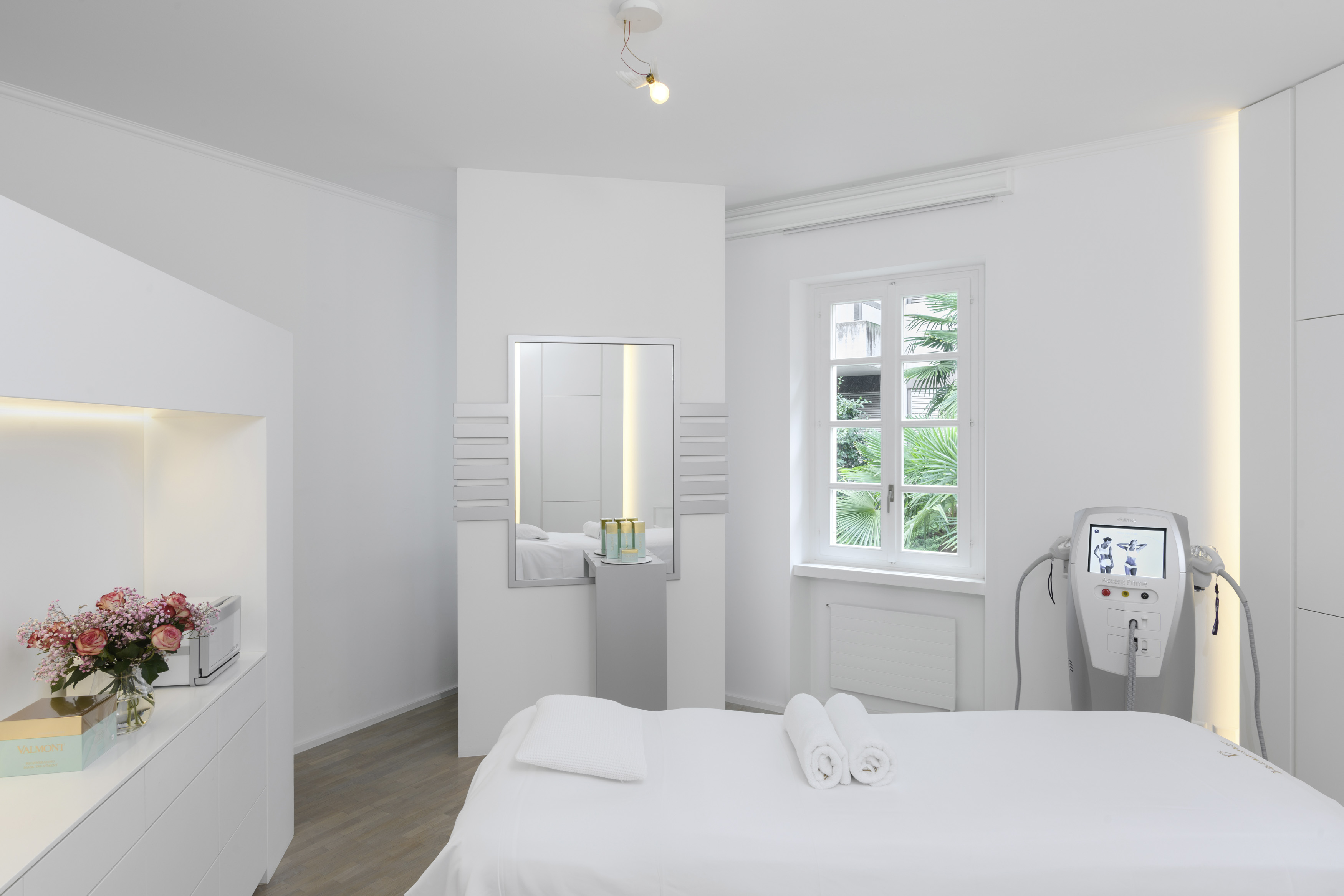
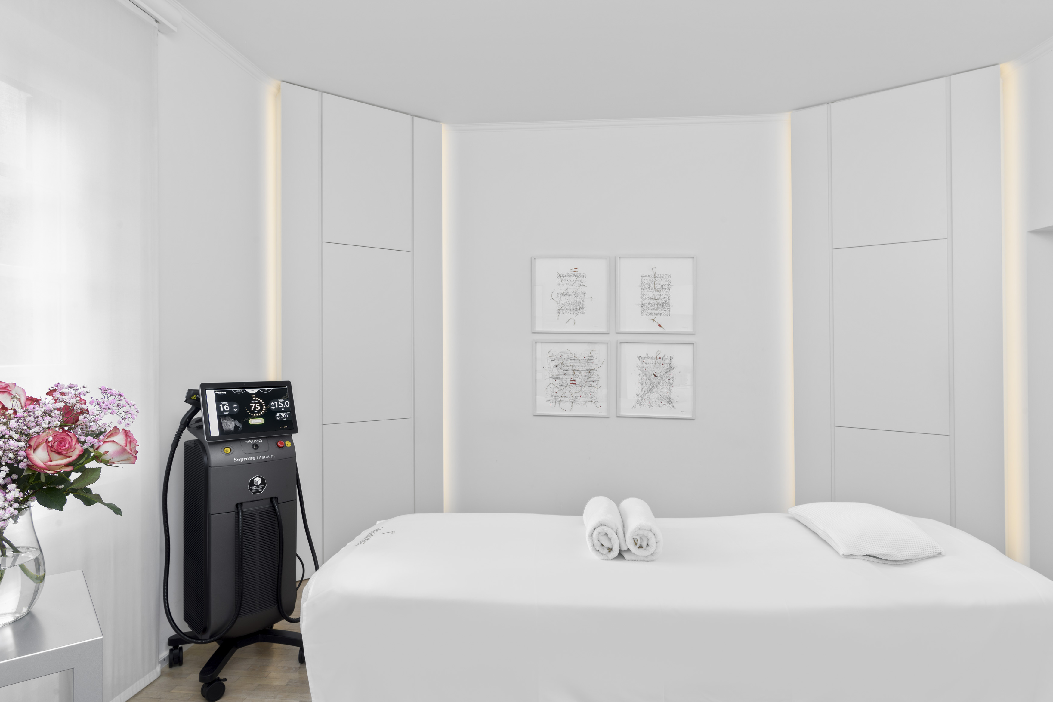
To showcase the spaces, style and atmosphere, the website design was enriched by the outstanding work of photographer Agi Simoes, who naturally conveyed the restrained white/light-grey style of the interiors.
Photographer
Agi Simoes
The homepage opens with an impactful video offering a complete overview of Studio17, and each section also opens with a hero video. The result is a strong perceptual impact, consistent with the concept’s motion design principles.

"This important milestone was made possible by Domenico Amodeo’s excellent design work. He understood our vision and translated it into a modern, elegant and user-friendly website. His attention to detail and tailored approach contributed to a result that reflects Studio17’s values: experience, innovation and a focus on the individual."
or

© 2026 - Amodeo Design. All rights reserved.
Powered with
by myself.
We use cookies and similar technologies to improve your experience on our website. Read our Privacy Policy.